Distribution of User Visits
What makes a quality user session? Number of pages? Amount of time spent on site?
Google Analytics‘ reductive tendency.
Site owners will always hope for the end-user to convert – be it purchasing a product, or getting in contact.
However, there are other more subtle actions users take which can be telling.
Even if a user has no immediate need for a site, we still want to know that they found something about it useful or interesting.
Google Analytics has a nasty habit of providing a singular number (average) for metrics which are in fact much more dynamic.
Session Duration is an average. Pages per Session is as well. These averages are at the mercy of bounce-rate and the fateful long-tail. Any goals or reports on these metrics can only hope that the number is higher.
By exporting the number of pages viewed for each user-session, as well as the amount of time spent, I was able to find the full distribution of session durations.
Session Duration: East Lake, Q1.
This graph (to 120 seconds) makes up 66% of user sessions. Expanding to the right up to 240 seconds would contain 95% of the data.
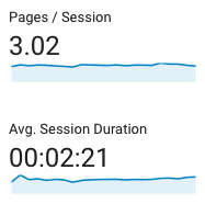
Google Analytics: the session duration average is 2:21 (141 seconds).
Pages per Session: East Lake, Q1
Google Analytics: the pages per session average is 3.02.
A larger volume of traffic helps to ‘smooth’ out the curve.
Session Duration: Wier/Stewart, Q1.
Google Analytics says 2:49 (169 sec) is the average Session Duration.
Pages per Session: Wier/Stewart, Q1
Google Analytics calls this 2.43 pages / session. Only data within the first 30 seconds is valid, since there’s less traffic after that.
Session Duration: VeryVera, Q1.
Google Analytics: 2:54 (174 sec) Average Session Duration
Pages per Session: VeryVera, Q1
Google Analytics: 3.6 Average Pages per Session
Variability in the Session Durations shows a potential for 2 groups of users for Wier/Stewart: those under and over 20 seconds.
Wier/Stewart also has fewer users after the 30 second mark, so statistical relevance is weaker, shown by wildly diverging lines.
Take-away:
While this model has not been fully applied yet, it certainly surfaces user-experience features which can be tracked against site and content changes.
I’ve learned there’s at least 3 steps to data-exploration, each with their own set of parameters:
- That something happened: Wier/Stewart has a ‘bump’ that other sites data don’t have.
- What or How it happened: The quality of the Wier/Stewart site data indicates a higher number of users with shorter sessions.
- Why it happened: Why are there proportionally more shorter sessions? Repeat visitors, thirsting for more? Terribly irrelevant content? For now, this is an ongoing, open quesetion.
Month to month may only change the average .08 percentage-points, which is no real help or encouragement for teams looking for results.
Being able to see the full data curve at 10-second intervals allows for a much more diverse story to be told, or at least a more complete baseline to be held.
